Domain:
Sales Tech
Category:
Web Design
Overview & Problems
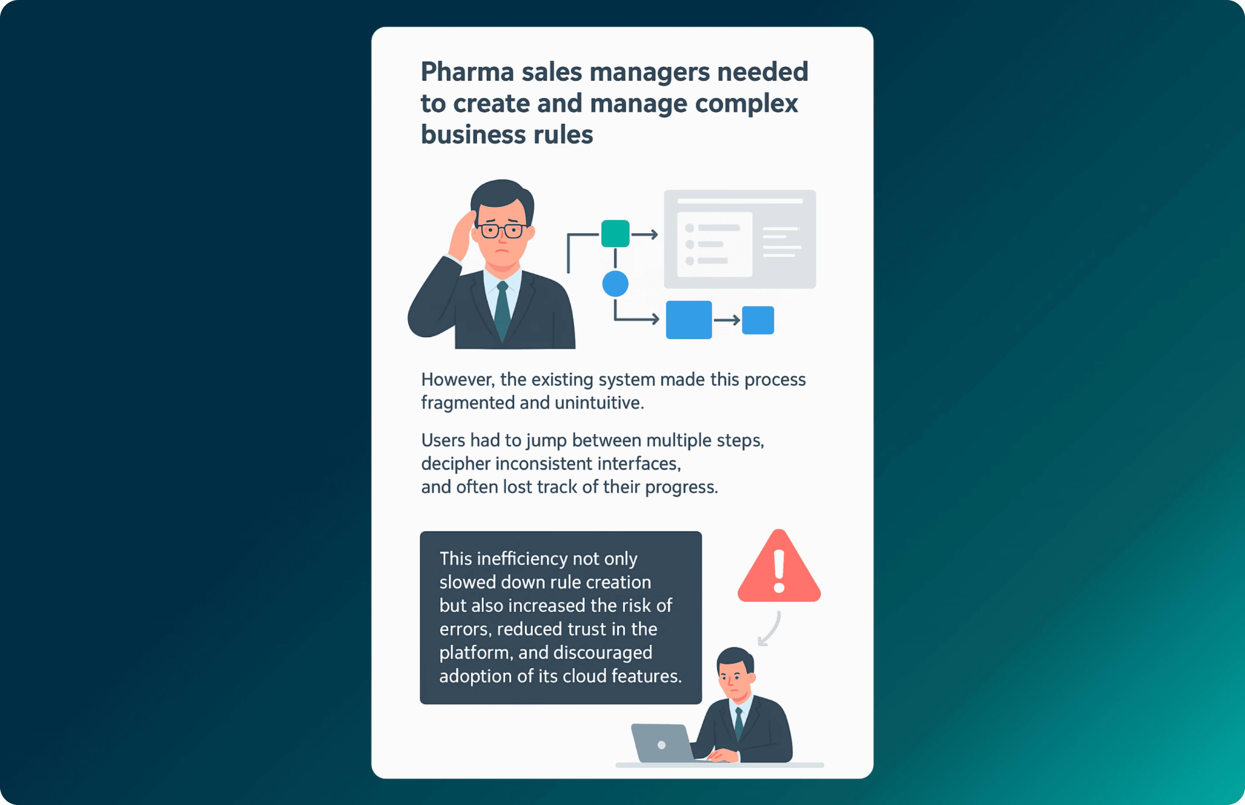
Context: This work was done as re-imagining a web-application - Sale performance management system. This application is used by leading pharmaceutical companies for managing their product sales.
My Role: UX Designer (research, IA, wireframes, high-fidelity UI, Usability testing).
Users: Pharma Sales Managers (rule creators), with downstream impact on Sales Reps.
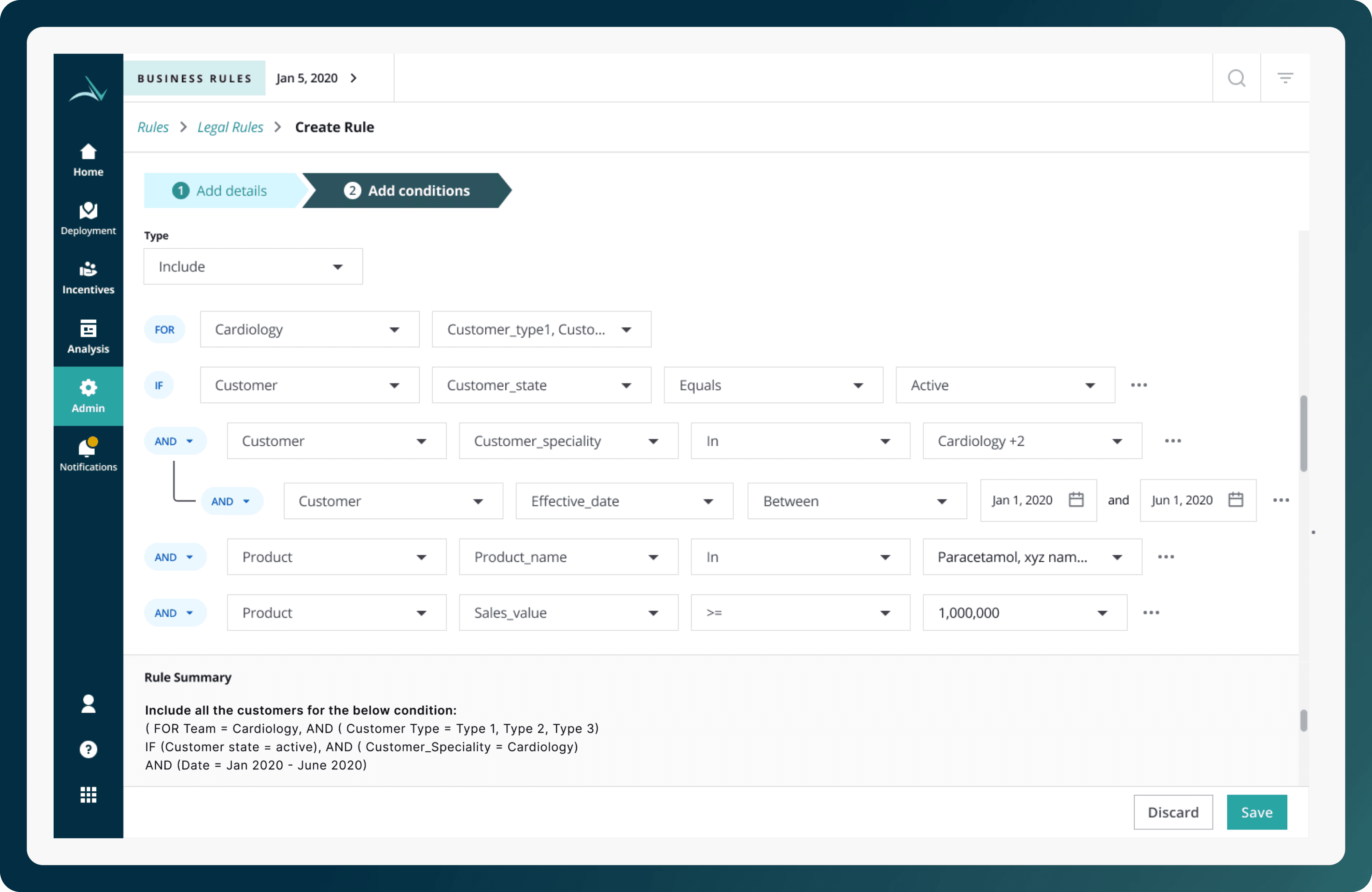
Business Goal: Simplify the process of creating business rules that decide which customers a medical representative should visit to.

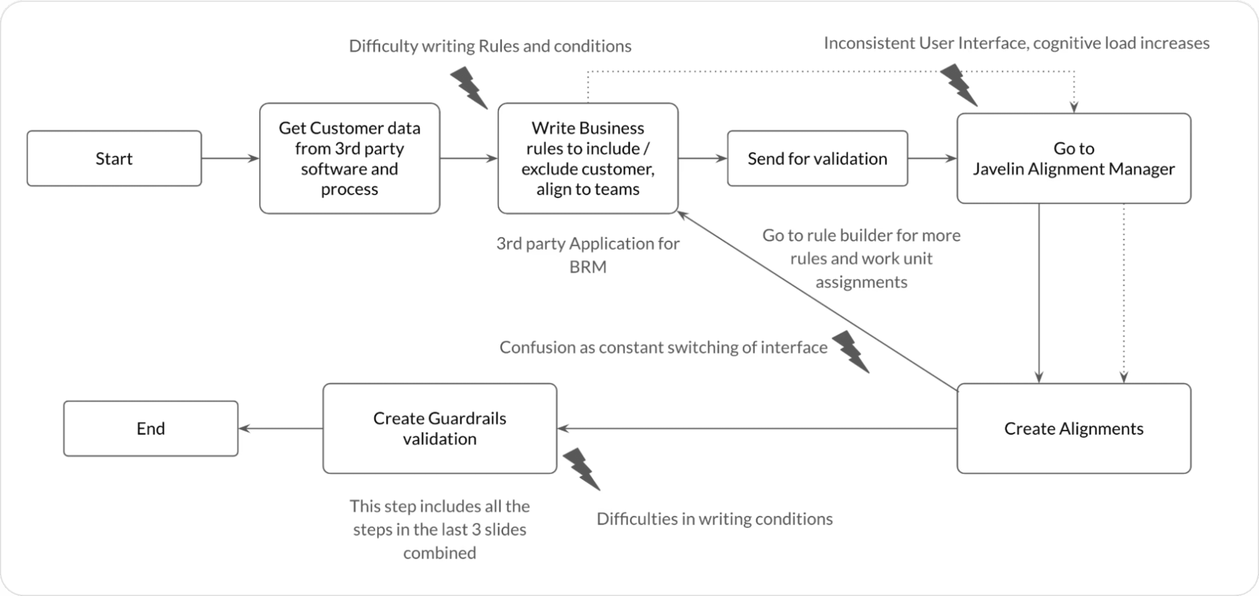
Before redesign:
Poor UI Interface, incapable of Nested Rules, outdated design language

Complex flow ( 3rd party dependencies, lot of breakpoints)
After redesign:
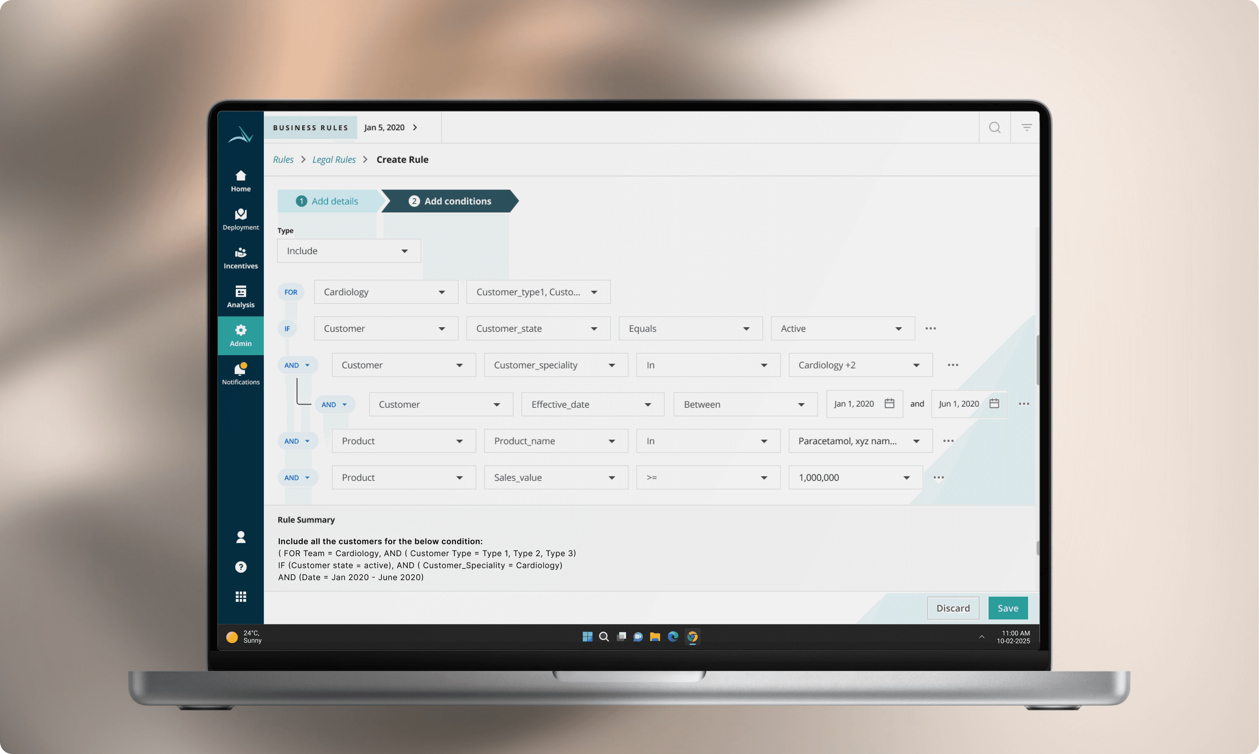
Modern look and feel, Intuitive UI, Capable of handling complex and nested rules, Rule summary at bottom
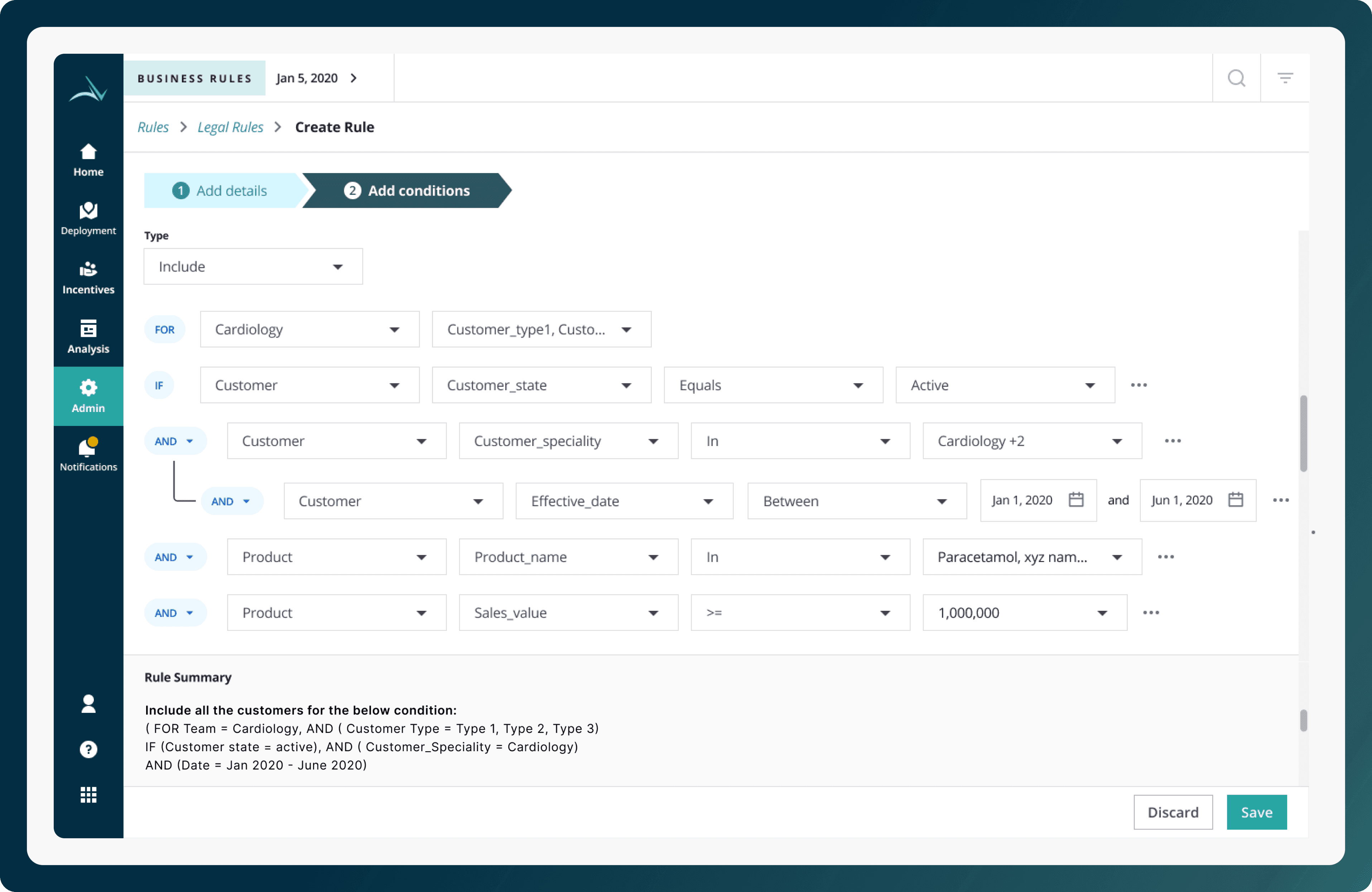
After: (Lesser clicks, simple flow, no 3rd party dependency):
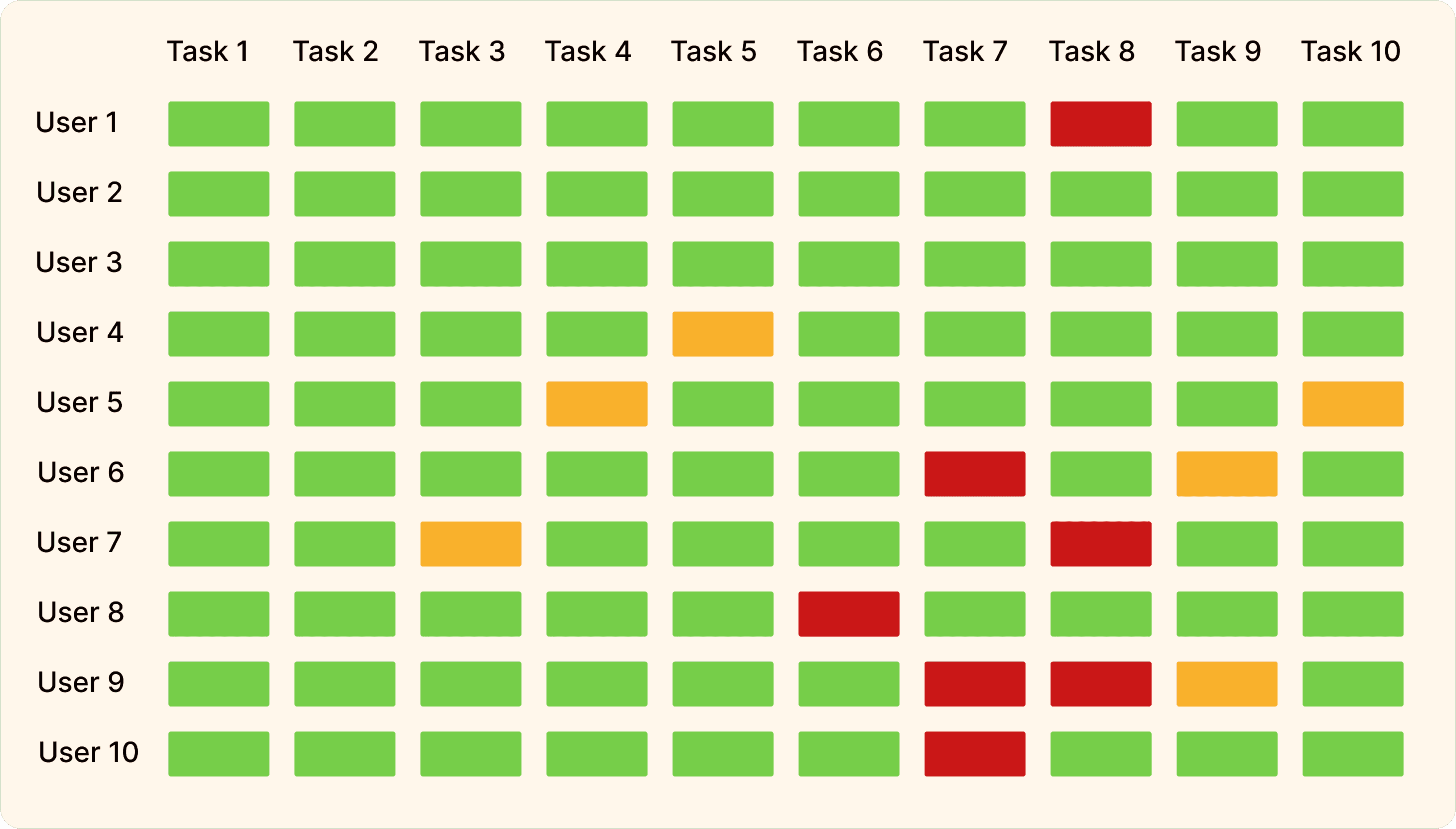
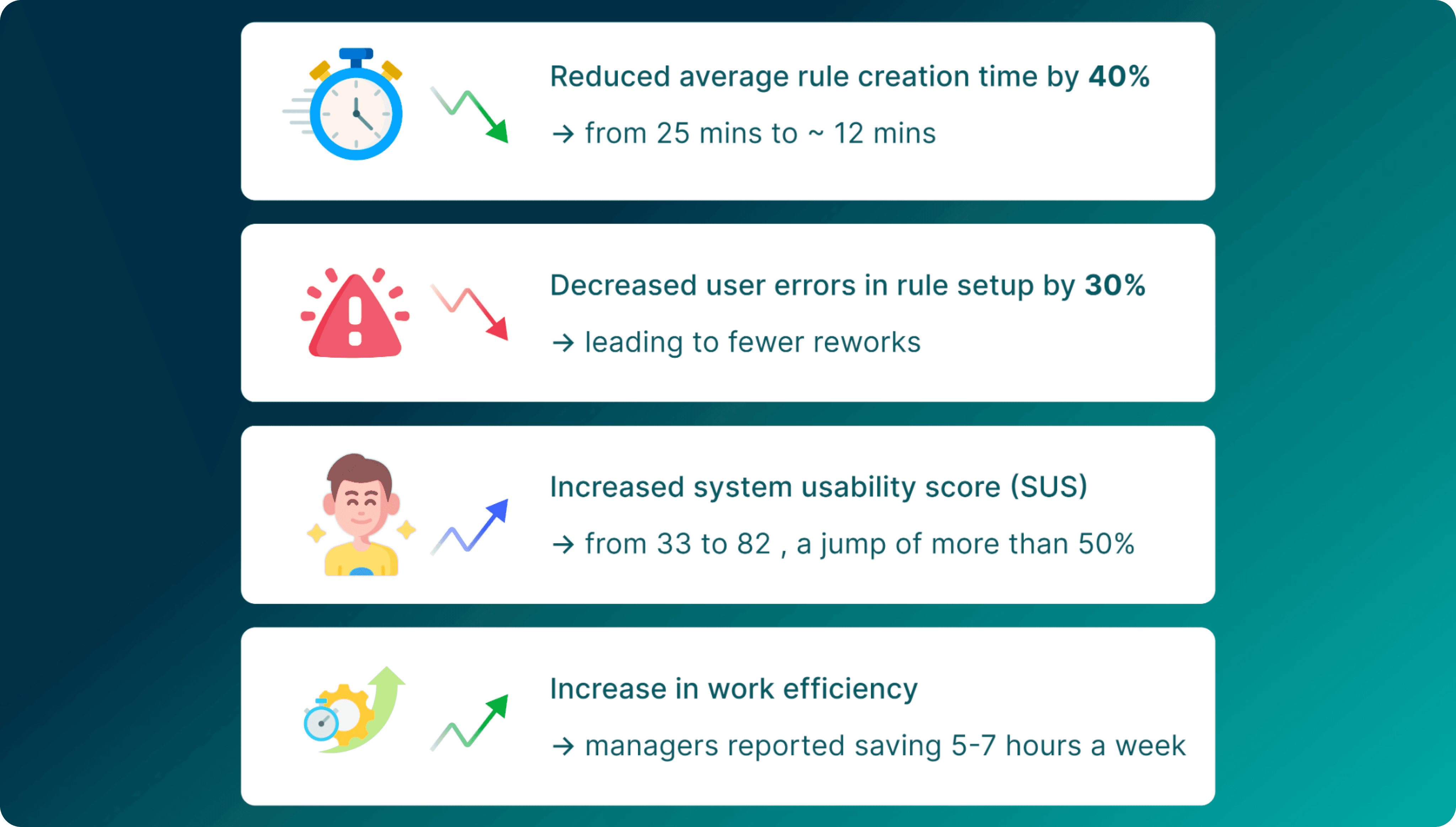
Impact & metrics
10 Different Users, 10 Different Tasks
User Emotion capturing:


Why was this design better?


The Process and approach

Design Audit:
1. Visibility - Partially Passed

Flexibility - Failed

Learnability - Failed

Existing Journey:

User research and discovery

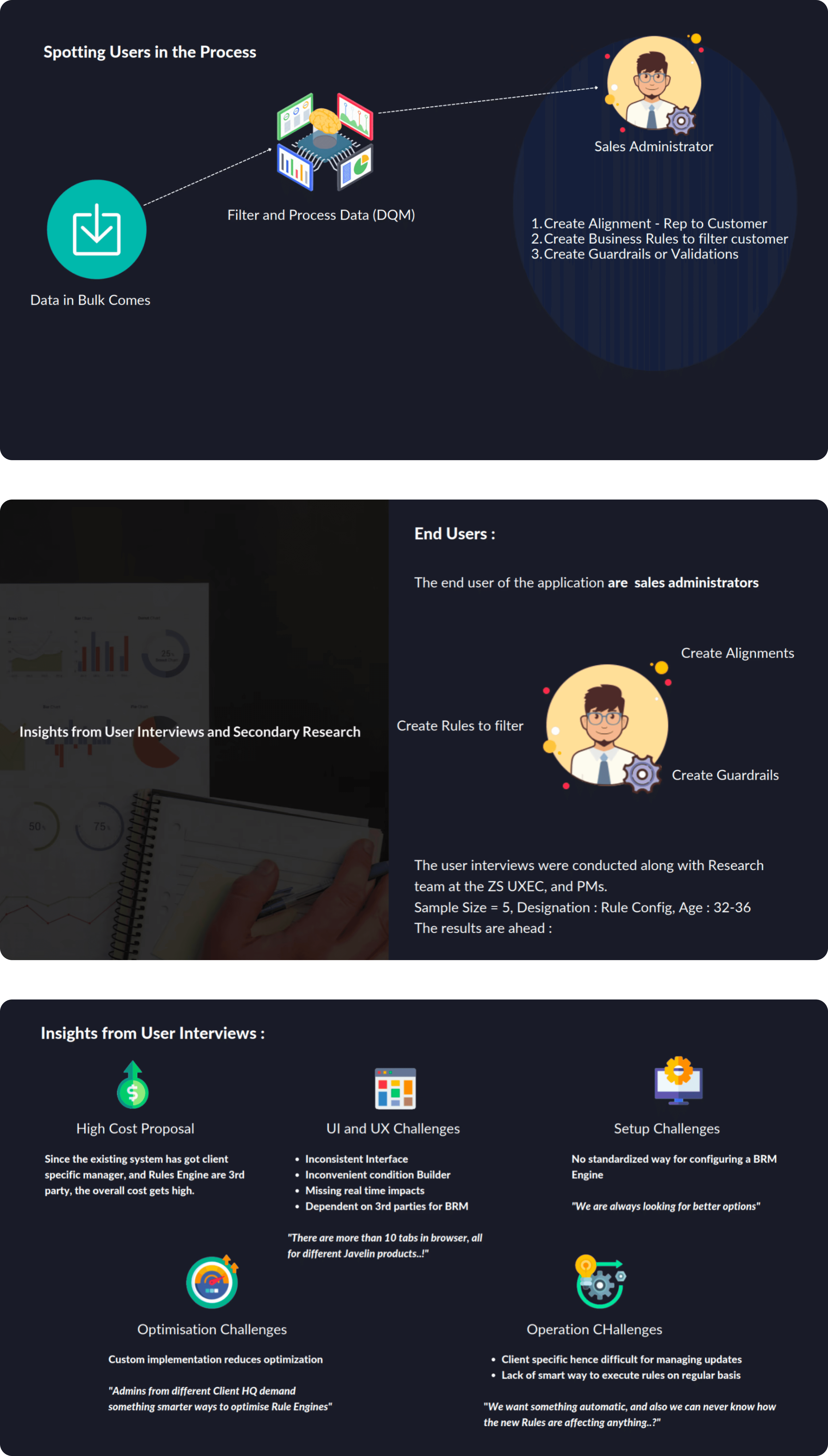
Personas:
The Expert Manager: Creates rules weekly, values power and flexibility

The Occasional User: Creates rules rarely, needs simplicity and guardrails

Deep-diving using the 5-why's technique:

Problem Statement:
Ideation:
Lotus Blossom technique - To brainstorm idea for each sub ideas generated for a main feature. Mindmapping we got:
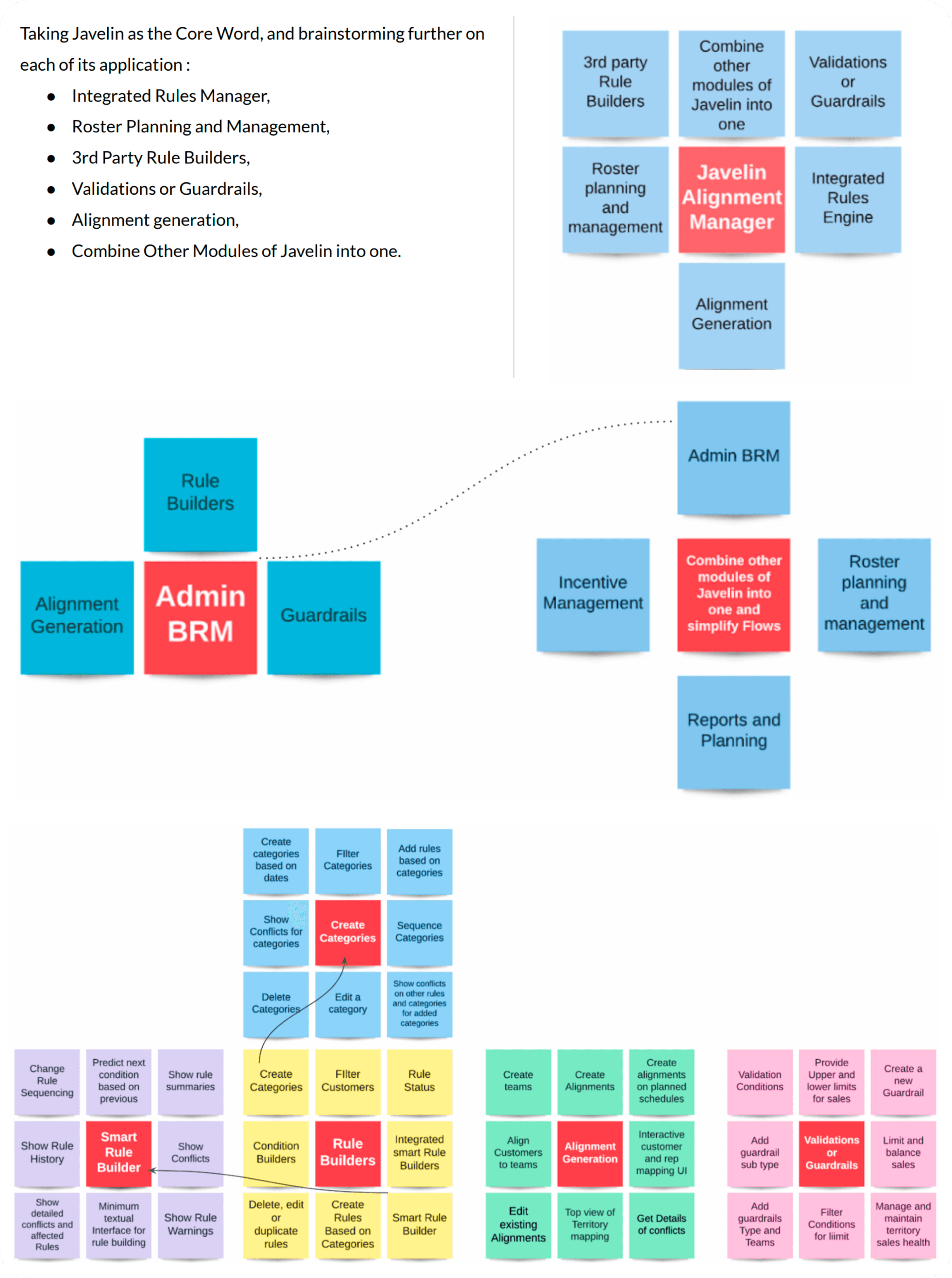
Mindmaps:
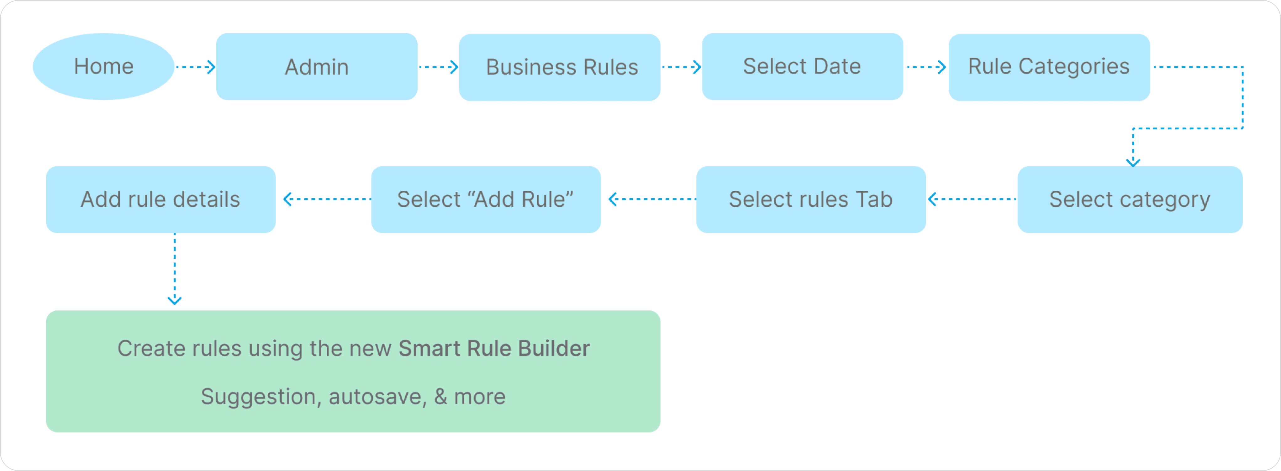
User flow : Lesser clicks, simple flow, no 3rd party dependency

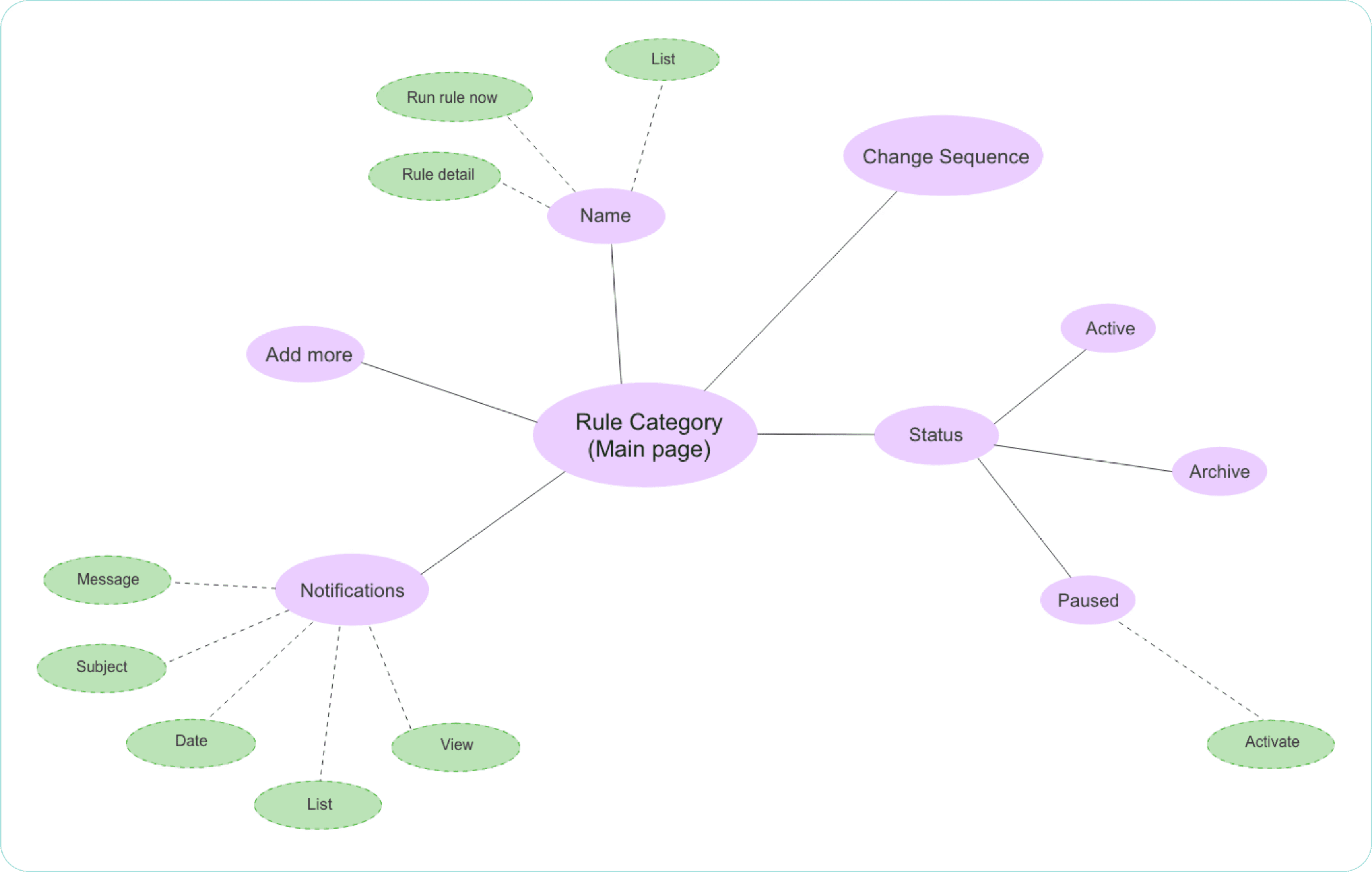
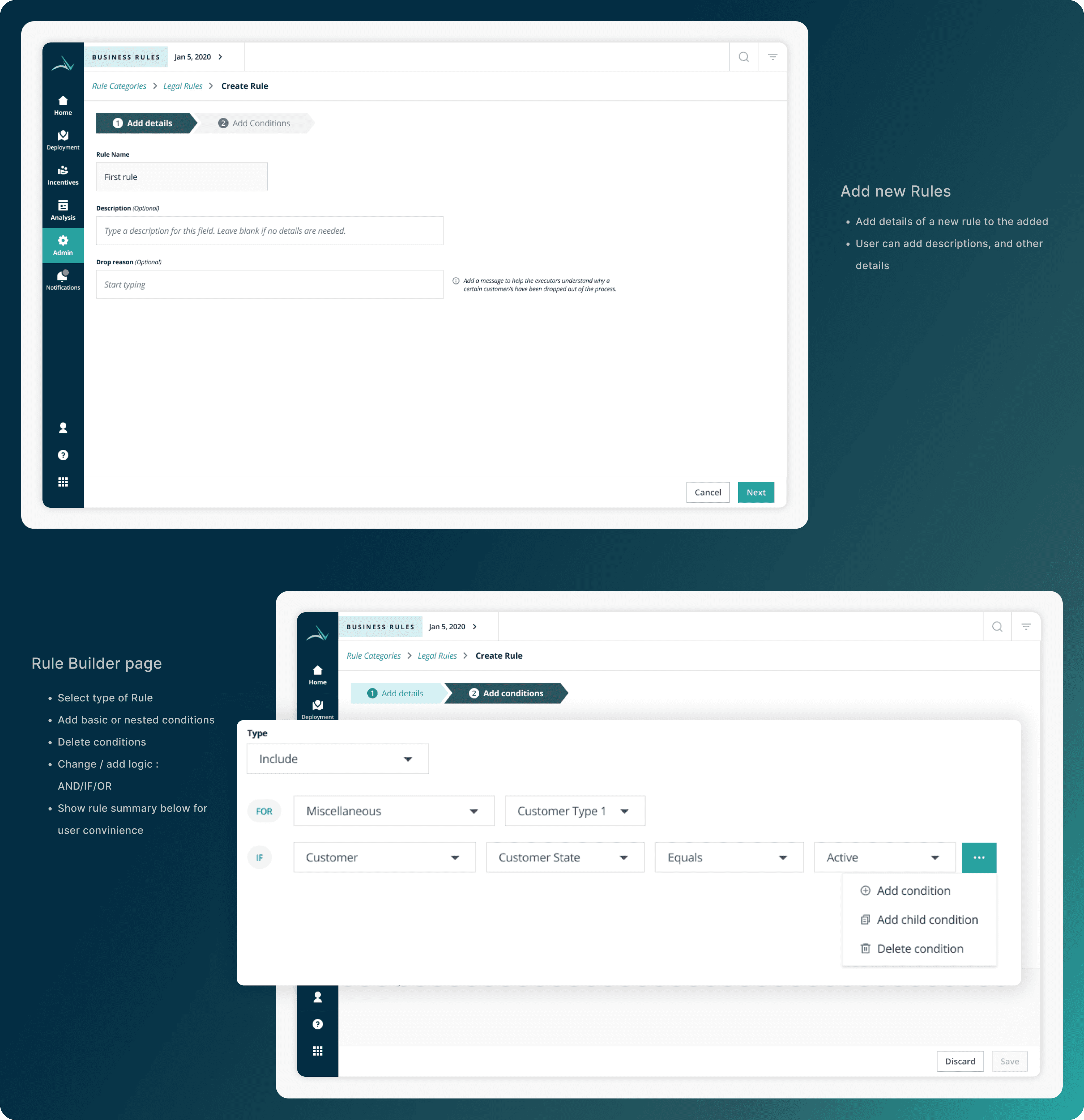
User Flow - Navigate to a Rule :

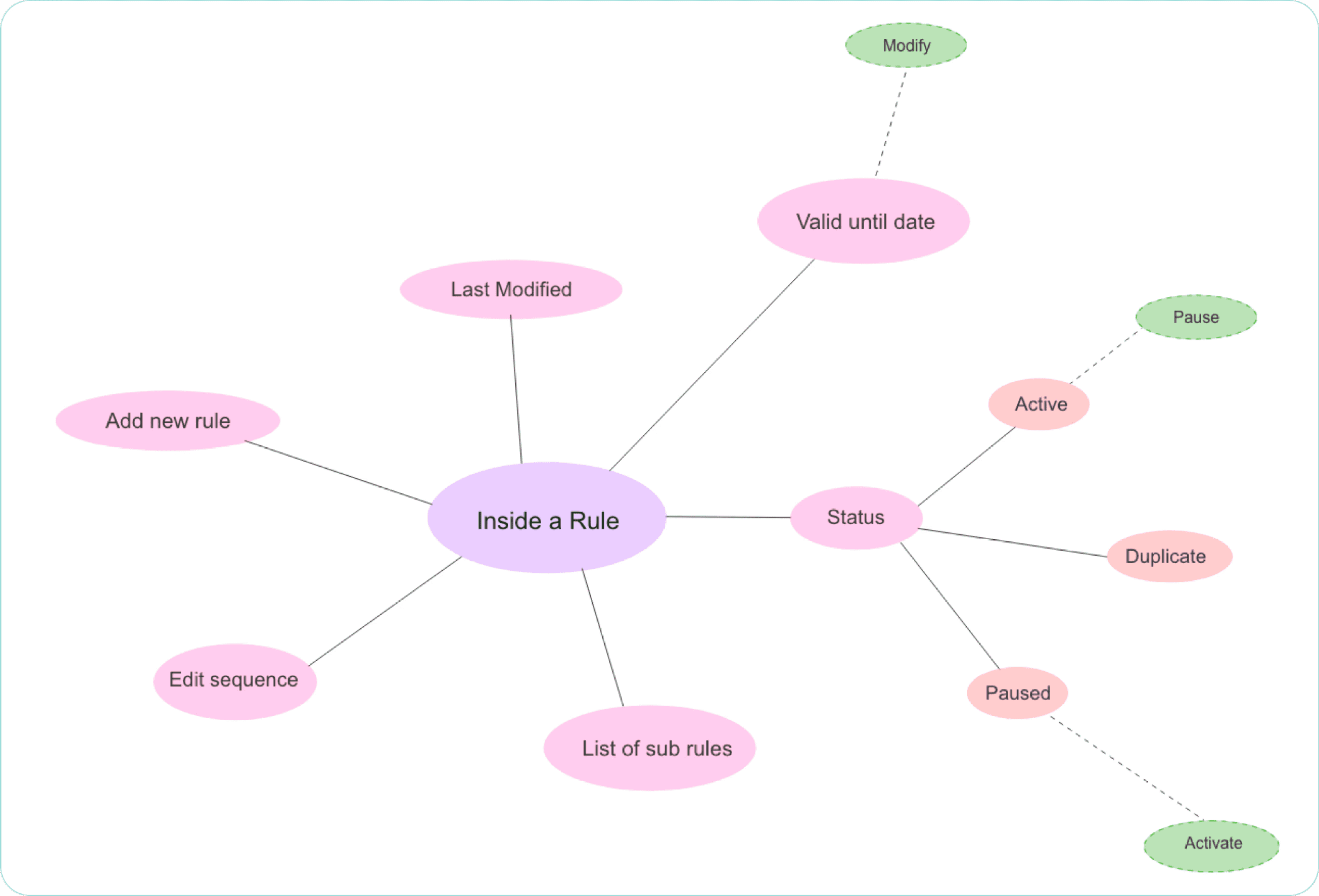
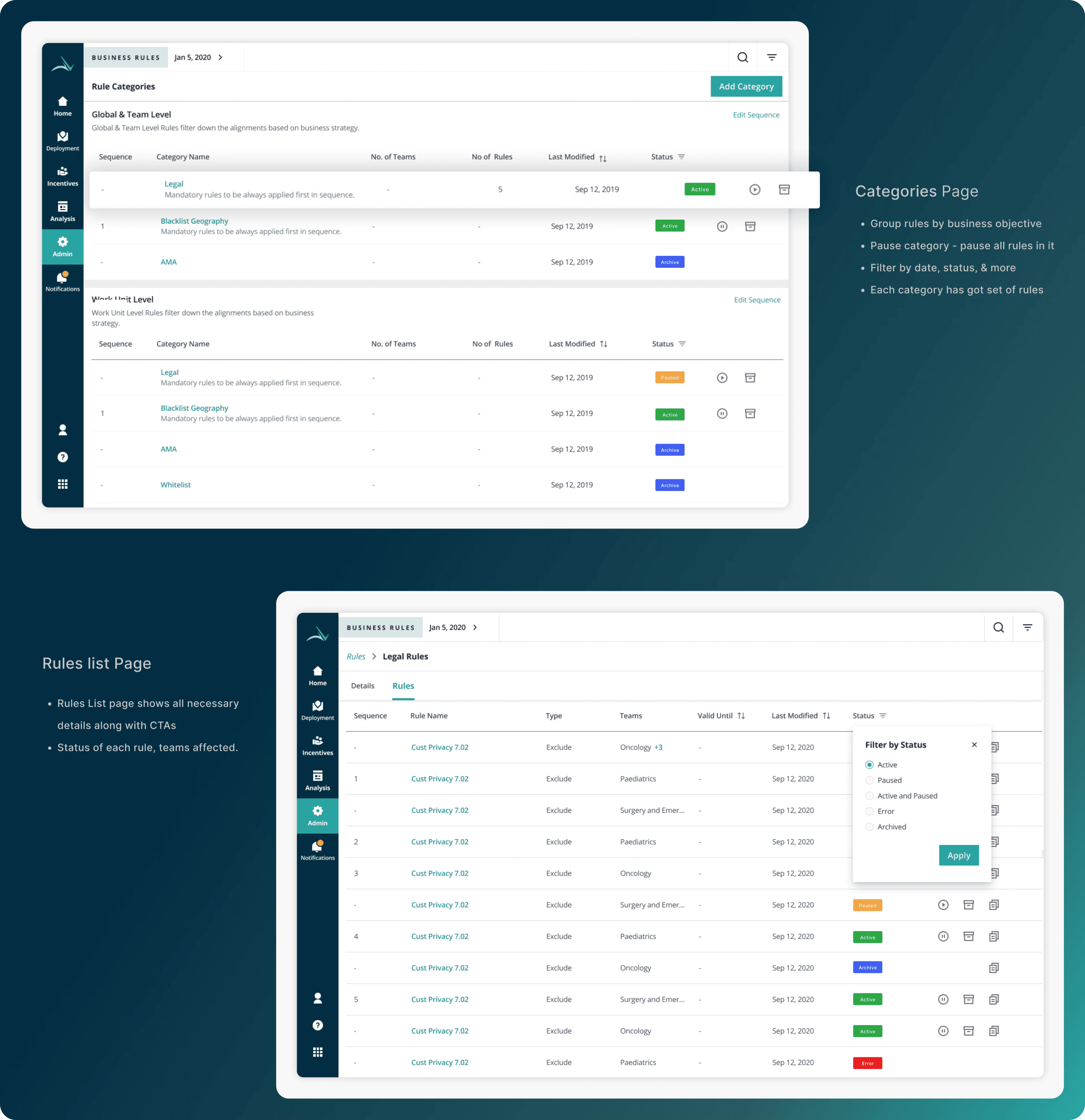
User flow - Create rule categories:

Visual Designs - Key Screens:
Final Outcome:
Sales managers can now:
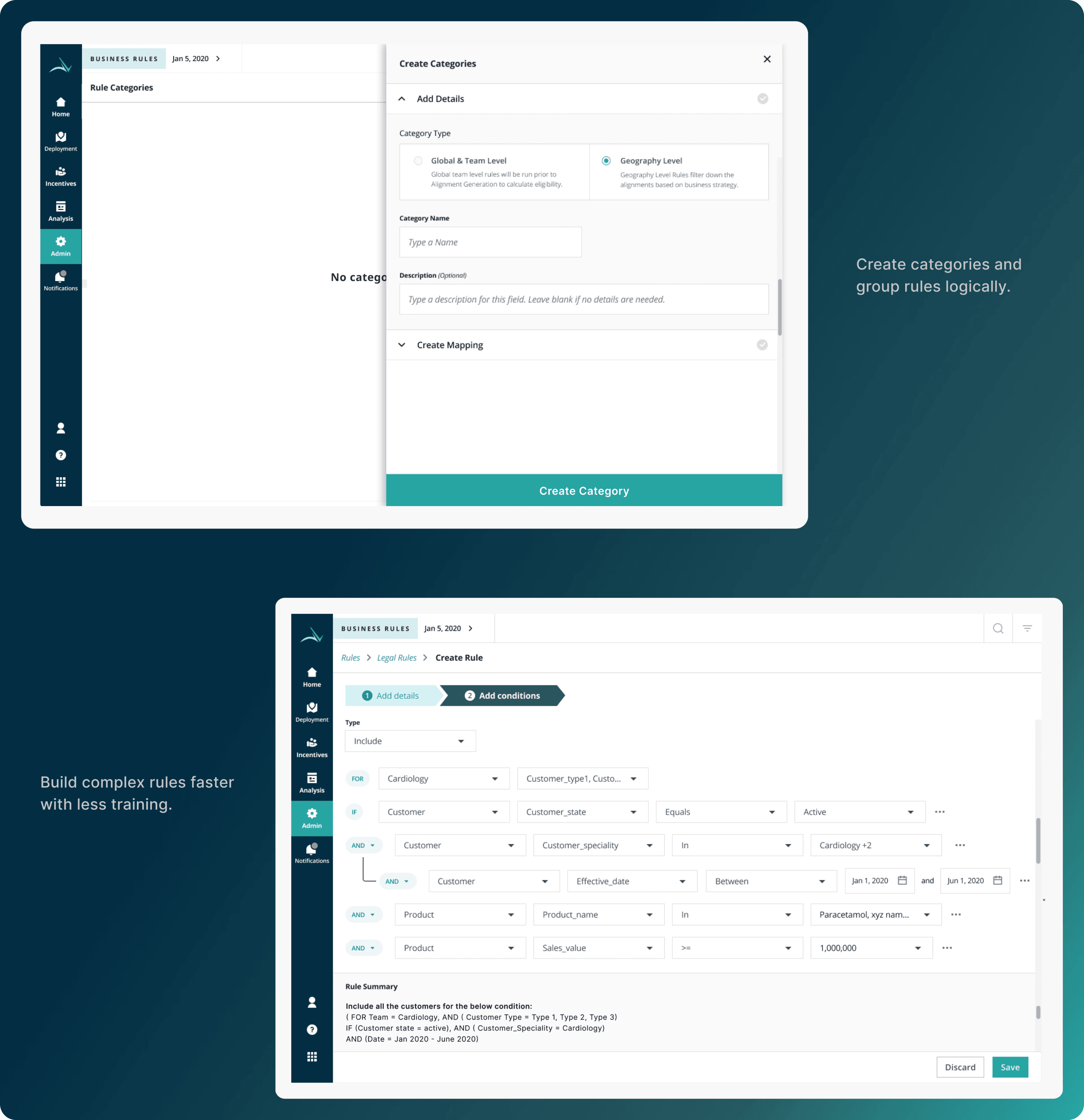
Create categories and group rules logically.
Build complex rules faster with less training.
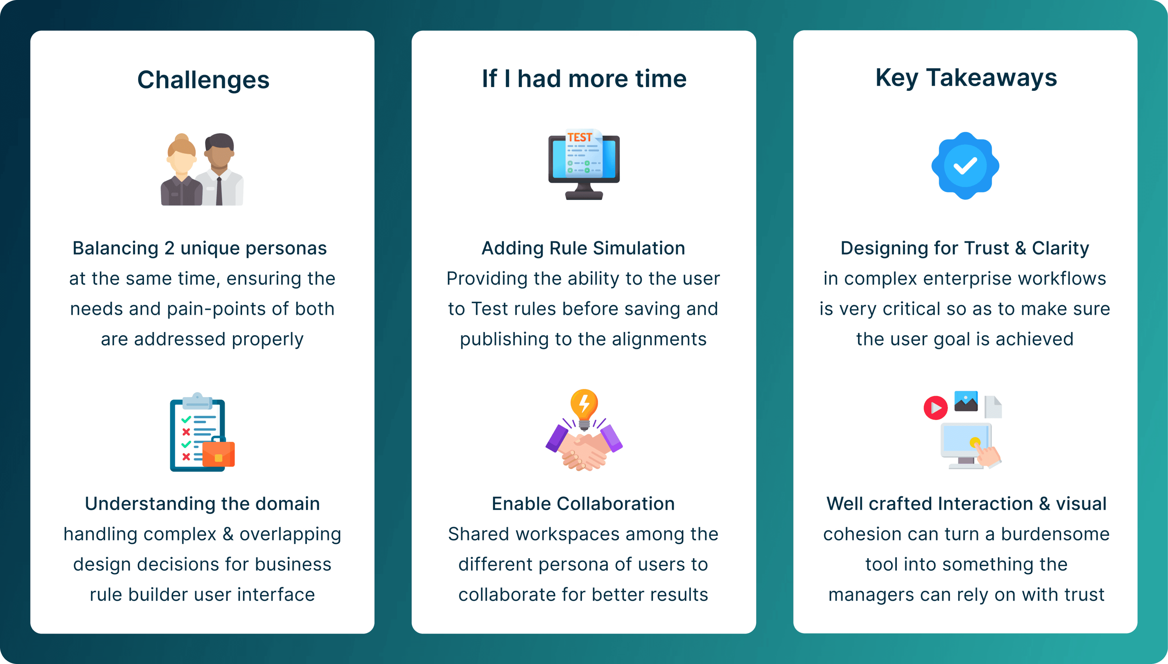
Key takeaways